Whether complementing or contrasting an existing palette or exclusively collecting a new or beloved heirloom colour, Le Creuset offers more colours than any other cookware brand. The colour lab at our headquarters in France is unrivalled in the industry, with our experts constantly pushing the envelope of what is possible in colourful cookware. This design-forward approach has resulted in the release of some of the world's most sought-after shades – ones that become not only powerful style statements but also cherished collections.
But with so many hues to choose from, we know it can be hard to narrow down the choices. If you're not sure where to start to find your favourite shade, just follow this easy guide to pick your Le Creuset colour palette.
Is Your Colour Style Bold and Bright?
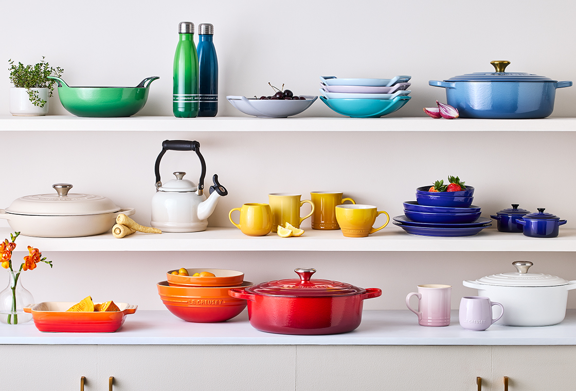
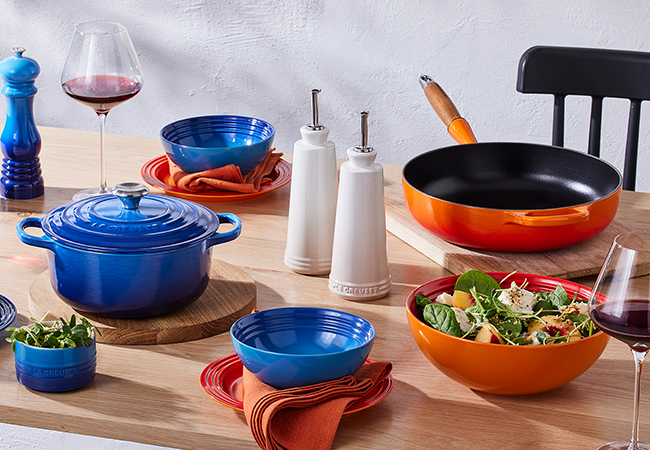
The first question to ask when finding your colour style is whether you like a more casually colourful style or whether you prefer to keep it neutral. If you're into colour, you might prefer a tonal palette where all of the colours create a beautiful ombré effect. Or you might want to pair colours from opposite ends of the spectrum – the term 'opposites attract' works when it comes to colour. The key to working with contrasting colours is to keep the hue and saturation similar for a more unified look.
Tonal Palette
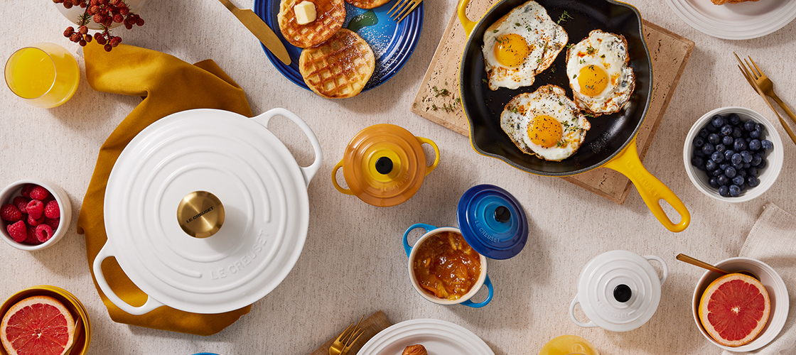
Keep it timeless and elegant with this classic tonal pairing of Brioche, White, Flint and Matte Black.
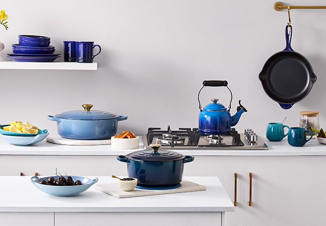
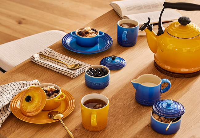
The individual variation in the cool tropical blue of Caribbean Blue, Azure, Agave and Chambray come alive when paired together.
Opposites Attract
Garden Party Vibes
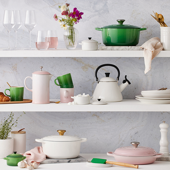
Often a source of inspiration for us, look to the natural world for some of the best colour pairings. One we're particularly loving right now was inspired by a spring garden party with vibrant Bamboo, Shell Pink, and a fresh pop of White.
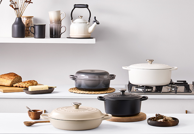
Do You Prefer Neutrals?
On the other end of the colour continuum, neutrals provide a soothing sense of stability and order that many people prefer over bright colours. They work together to create a layered, calming effect or can also work to soften a more colourful palette. Most often, we think of neutrals as simply shades in the white-to-black spectrum, but a more modern approach incorporates soft blues, greens and even pinks and purples to create a soothing, neutral palette.
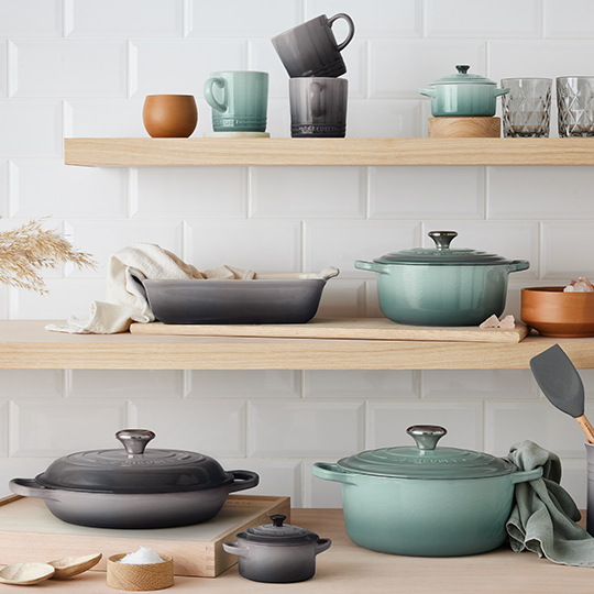
On-Trend with the New Neutrals